Mobile Controls
- What Are the Different Types of Controls?
Include files (*.inc) are evaluated within the referencing template and can be useful for repeated blocks of code. They can have parameters, such as :nc (do not evaluate comments) or :parameterName=pValue (named parameter), and are included with the /(!example) marker
Control Templates (*.ctrl) contain scripts to mimic default Plex behavior. Default templates can be overridden the control name property template= followed by the control template name without the extension, e.g. template=DojoDateEdit
Page Templates (*-page.wcli) must be below the root template function in the Plex inheritance path. It does not contain a complete HTML page, but it can contain any components that you want to manually add to any function in the inheritance path other than the root. It is always processed before the Control Template and applied by inheriting from the function with the same implementation name. Multiple Page templates can be applied and adds contents to defined attach points in the root template, e.g.:
/(!MainArea)
Anything here will be generated in the MainArea
/(!MainArea)Root Templates (*-root) contain a complete HTML page, but nothing corresponds to a Plex panel control. It’s analogous to a root function (function shell) in Plex. It does not have to be the action diagram root, but it can be any function in the inheritance path. It’s the first template to be expanded during template generation. Each panel can only have one root, which contains ‘attach points’ to include later templates, e.g./(!AttachPoint:name=MainArea)
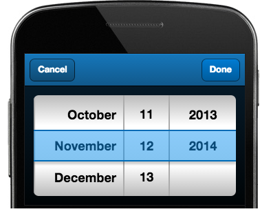
- CalendarPicker.ctrl
- This is a specialized field which shows a calendar layout when tapped. If it has a predefined value or a value is selected in the calendar picker, it will be displayed like a normal text field.
- WebClient Control Name Parameters
WebClient Control Name Parameters
name: String
The field’s HTML name attribute. This property comes from the first element in the control name.controlName: String
This field contains a copy of control name property from the Plex panel.label: String
The label of this field.Control Name Parameter: label
Alternative way to set a label of the field.
For example: Plex edit field control name is set to myField.
You can set the control name of the Plex label field to myFieldLbl:myField.LabellabelWidth: String
The width of the field label. The value defaults to 40% unless specified in the controlName. The param name to specify the width is called width.
For example: width=50%Control Name Parameter: width
yearFrom: Number
The start year for the calendar picker. If yearFrom is greated than yearTo then the order of years will be reversed.Control Name Parameter: yearFrom
yearTo: Number
The last year for the calendar picker.Control Name Parameter: yearTo
- Javascript Config Attributes
disabled: Boolean
Whether or not the component is disabled.hidden: Boolean
Whether or not the component is hidden.value: Object/Date
The calendar field value. Accepts an object of ‘year’, ’month’, and ’day’ values, all of which should be numbers, or a Date. - Events
focus (Plex event: Gained Focus)
Attempts to set the field as the active input focus.blur (Plex event: Lost Focus)
Fires when the field loses input focus.change (Plex event: Updated)
Fires when a date is selected.
- DatePicker.ctrl
- This is a specialized field which shows a slot date picker when tapped. If it has a predefined value or a value is selected from the date picker, it will be displayed like a normal text field.
- WebClient Control Name Properties
name: String
The field’s HTML name attribute. This property comes from the first element in the control name.controlName: String
This field contains a copy of control name property from the Plex panel.cls: String
The CSS class to add to this control element.Control Name Parameter: class
label: String
The label of this field.Control Name Parameter: label
Alternative way to set a label of the field.
For example: Plex edit field control name is set to myField.
You can set the control name of the Plex label field to myFieldLbl:myField.LabelExamples


- Javascript Config Attributes
value: Object/Date
The calendar field value. Accepts an object of ‘year’, ’month’, and ’day’ values, all of which should be numbers, or a Date.disabled: Boolean
Whether or not the component is disabled.hidden: Boolean
Whether or not the component is hidden. - Events
focus (Plex event: Gained Focus)
Attempts to set the field as the active input focus.blur (Plex event: Lost Focus)
Fires when the field loses input focus.change (Plex event: Updated)
Fires when a date is selected.
- ExternalUrl-page.wcli
- This page template will launch the device browser to the URL that is set to the panel caption.
- PanelCaption-page.wcli
- This page template will display the Panel's caption in a title bar that is docked to the top of the screen.
- WebAudio.ctrl
- This is a simple container for HTML5 Audio element.
- WebClient Control Name Properties
id: String
The unique id of this control.name: String
The field’s HTML name attribute. This property comes from the first element in the control namecontrolName: String
This field contains a copy of control name property from the Plex panel. - Javascript Config Attributes
url: String
The location of the audio to play.disabled: Boolean
Whether or not the component is disabled.hidden: Boolean
Whether or not the component is hidden.
- WebCamera.ctrl
- This is a container for a button that will launch the device camera, and return a Base64 encoded string for the image taken. In Plex, the field must be a VaryCharacter Edit Field in order to store the full Base64 string. The control will only work if the application has been properly packaged and installed on the device.
- WebClient Control Name Properties
id: String
The unique id of this control.name: String
The field’s HTML name attribute. This property comes from the first element in the control namecontrolName: String
This field contains a copy of control name property from the Plex panel.iconCls: String
Optional CSS class to add to the icon element. This is useful if you want to use a CSS background image to create your Button icon.Control Name Parameter: iconCls
The list of iconCls that can be used are below.
- star
- trash
- maps
- locate
- home
- bookmarks
- download
- favorites
- info
- more
- time
- user
- team
- action
- add
- arrow_down
- arrow_left
- arrow_right
- arrow_up
- compose
- delete
- organize
- refresh
- reply
- search
- settings
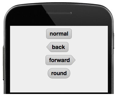
ui: String
Optional style to apply to your button.Control Name Parameter: ui
The list of ui that can be used are below:
'normal'- a basic gray button (default).'back'- a back button.'forward'- a forward button.'round'- a round button.'plain''action'- shaded using the $active-color .'decline'- shaded using the $alert-color .'confirm'- shaded using the $confirm-color .
Examples


- Javascript Config Attributes
disabled: Boolean
Whether or not the component is disabled. - Events
getPicture
Triggered after a photo is taken and accepted.
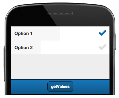
- WebCheckbox.ctrl
- The checkbox field is an enhanced version of the native browser checkbox. It enables the user to choose one or more items from a set of options. The Text value of the field in Plex will be the label for the field.
- WebClient Control Name Properties
id: String
The unique id of this control.name: String
The field’s HTML name attribute. This property comes from the first element in the control namecontrolName: String
This field contains a copy of control name property from the Plex panel.cls: String
The CSS class to add to this control element.Control Name Parameter: cls
labelWidth: String
The width of the field label. The value defaults to 40% unless specified in the controlName. The param name to specify the width is called width.
For example: width=50%Control Name Parameter: width
Examples

- Javascript Config Attributes
uncheckedValue: String
The unchecked value of the field.checkedValue: String
The checked value of the field.value: String
The value to submit if the item is in a checked state.disabled: Boolean
Whether or not the component is disabled.hidden: Boolean
Whether or not the component is hidden. - Events
focus (Plex event: Gained Focus)
Attempts to set the field as the active input focus.blur (Plex event: Lost Focus)
Fires when the field loses input focus.change (Plex event: Updated)
Fires just before the field blurs if the field value has changed.
- WebCombo.ctrl
- A component to display combo field.
- WebClient Control Name Properties
name: String
The field’s HTML name attribute. This property comes from the first element in the control namecontrolName: String
This field contains a copy of control name property from the Plex panel.cls: String
The CSS class to add to this control element.Control Name Parameter: cls
label: String
The label of this field.Control Name Parameter: label
Alternative way to set a label of the field.
For example: Plex edit field control name is set to myField.
You can set the control name of the Plex label field to myFieldLbl:myField.LabelExample
- Javascript Config Attributes
options: Array
An array of select options.value: String
A value to initialize this field with.disabled: Boolean
Whether or not the component is disabled.hidden: Boolean
Whether or not the component is hidden. - Events
focus (Plex event: Gained Focus)
Attempts to set the field as the active input focus.change (Plex event: Updated)
Fires just before the field blurs if the field value has changed.blur (Plex event: Lost Focus)
Fires when the field loses input focus.
-
- A component that allows data to be saved to local storage. This component is not shown. The saved cookie is loaded into the field when the component is painted onto the screen. When the field's value is Put in Plex, the cookie is saved.
- WebClient Control Name Properties
name: String
The field’s HTML name attribute. This property comes from the first element in the control namecontrolName: String
This field contains a copy of control name property from the Plex panel.
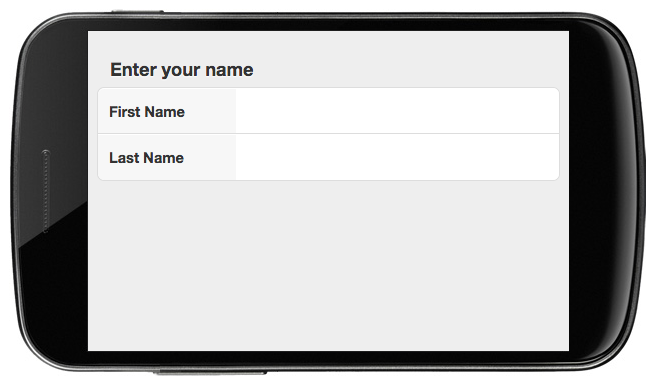
- WebEdit.ctrl
- A component to display input field.
- WebClient Control Name Properties
id: String
The unique id of this control.name: String
The field’s HTML name attribute. This property comes from the first element in the control namecontrolName: String
This field contains a copy of control name property from the Plex panel.cls: String
The CSS class to add to this control element.Control Name Parameter: cls
label: String
The label of this field.Control Name Parameter: label
Alternative way to set a label of the field.
For example: Plex edit field control name is set to myField.
You can set the control name of the Plex label field to myFieldLbl:myField.LabellabelWidth: String
The width of the field label. The value defaults to 40% unless specified in the controlName. The param name to specify the width is called width.
For example: width=50%Control Name Parameter: width
extraControl: Component
For attaching another edit field on the same row.
For example: The control name of the first edit field is myFirstField:MainArea
The control name of the second edit field is mySecondField:myFirstField.ExtraControlplaceHolder: String
A string value displayed in the input when the control is empty if specified in the control name.Control Name Parameter: hint
Examples


- Javascript Config Attributes
value: Mixed
A value to initialize this field with.maxLength: Number
The maximum number of permitted input characters.disabled: Boolean
Whether or not the component is disabled.hidden: Boolean
Whether or not the component is hidden. - Events
focus (Plex event: Gained Focus)
Attempts to set the field as the active input focus.blur (Plex event: Lost Focus)
Fires when the field loses input focus.keyup (Plex event: Modified)
Fires when a key is released on the input element.change (Plex event: Updated)
Fires just before the field blurs if the field value has changed.
- WebEditableGrid.ctrl
- An editable DataView which allows editing an array of data.
- WebClient Control Name Properties
baseCls: String
The base CSS class to apply to this component’s element.Control Name Parameter: gridClass
The Grid Header Columns will be create with CSS class of "*gridClass*h". For example, if gridClass = myGrid, then the CSS class will be "myGridh".
CSS entries are need to in order to lay out the Editable Grid properly. Entries should look something like this (note: # needs to be the actual column number. The first column number is 0.):.myGridh .head0 .col#,
.myGrid .col#{
width: 25%;
}controlName: String
This field contains a copy of control name property from the Plex panel.cls: String
The CSS class to add to this control element.Control Name Parameter: class
onItemDisclosure: Boolean
True to display a disclosure item on each list item.Control Name Parameter: disclose
grouped: Boolean
Whether or not to group items in the provided Store with a header for each item.Control Name Parameter: grouped
indexBar: Boolean
True to render an alphabet index bar docked on the right.Control Name Parameter: indexBar
itemTpl: String
The template to use for each of the items displayed in the DataView.Control Name Parameter: tplGenerator
Please note that for this control template, the tplGenerator should be set to " wcli.util.gridColTpl".
itemCls: String
An additional CSS class to apply to items within the DataView.Control Name Parameter: itemClass
renderTplGenerator:String
The template to use for each of the columns displayed in the DataView.Control Name Parameter: renderTplGenerator
Please note that for this control template, the renderTplGenerator should be set to "wcli.util.gridColHdr".
- Javascript Config Attributes
store: Object
Can either be a Store instance or a configuration object that will be turned into a Store.disabled: Boolean
Whether or not the component is disabled. - Events
itemtap (Plex event: Select)
Fires whenever an item is tappedchange (Plex event: Updated)
Fires just before the field blurs if the field value has changed.
- WebEmail.ctrl
- The email field creates an HTML5 email input and is usually created inside a form. Most browsers will show a specialized virtual keyboard for email address input.
- WebClient Control Name Properties
id: String
The unique id of this control.name: String
The field’s HTML name attribute. This property comes from the first element in the control name.controlName: String
This field contains a copy of control name property from the Plex panel.cls: String
The CSS class to add to this control element.Control Name Parameter: class
iconCls: String
Optional CSS class to add to the icon element. This is useful if you want to use a CSS background image to create your Button icon.Control Name Parameter: iconCls
The list of iconCls that can be used are below.
- star
- trash
- maps
- locate
- home
- bookmarks
- download
- favorites
- info
- more
- time
- user
- team
- action
- add
- arrow_down
- arrow_left
- arrow_right
- arrow_up
- compose
- delete
- organize
- refresh
- reply
- search
- settings
ui: String
Optional style to apply to your button.Control Name Parameter: ui
The list of ui that can be used are below:
'normal'- a basic gray button (default).'back'- a back button.'forward'- a forward button.'round'- a round button.'plain''action'- shaded using the $active-color .'decline'- shaded using the $alert-color .'confirm'- shaded using the $confirm-color .
label: String
The label of this field.Control Name Parameter: label
Alternative way to set a label of the field.
For example: Plex edit field control name is set to myField.
You can set the control name of the Plex label field to myFieldLbl:myField.LabelcontactName: String
The name of the contact person.Control Name Parameter: contact
Alternative way to set the contactName attribute.
For example: Plex edit field control name is set to myEmail.
You can set the control name of the Plex label field to myEmailLbl:myEmail.LabelconfirmContact: Boolean
Display confirmation button if set to true. The default value is false.Control Name Parameter: confirm
Examples


- Javascript Config Attributes
disabled: Boolean
Whether or not the component is disabled.hidden: Boolean
Whether or not the component is hidden.text: String
Display the text set in Plex panel properties.contactUrl: String
The email address of the contact.
- WebGrid.ctrl
- Is a custom styled DataView which allows Grouping, Indexing, Icons, and a Disclosure.
- WebClient Control Name Properties
baseCls: String
The base CSS class to apply to this component’s element.Control Name Parameter: gridClass
controlName: String
This field contains a copy of control name property from the Plex panel.cls: String
The CSS class to add to this control element.Control Name Parameter: class
onItemDisclosure: Boolean
True to display a disclosure item on each list item.Control Name Parameter: disclose
grouped: Boolean
Whether or not to group items in the provided Store with a header for each item.Control Name Parameter: grouped
indexBar: Boolean
True to render an alphabet index bar docked on the right.Control Name Parameter: indexBar
itemTpl: String
The template to use for each of the items displayed in the DataView.Control Name Parameter: tplGenerator
itemCls: String
An additional CSS class to apply to items within the DataView.Control Name Parameter: itemClass
Example
- Javascript Config Attributes
store: Object
Can either be a Store instance or a configuration object that will be turned into a Store.disabled: Boolean
Whether or not the component is disabled. - Events
itemtap (Plex event: Select)
Fires whenever an item is tapped.
- WebHTML.ctrl
- Displays custom html in an edit field.
- WebClient Control Name Properties
id: String
The unique id of this control.name: String
The field’s HTML name attribute. This property comes from the first element in the control name.controlName: String
This field contains a copy of control name property from the Plex panel.cls: String
The CSS class to add to this control element.Control Name Parameter: class
- Javascript Config Attributes
html: String
HTML content to render inside this Component or a reference to an existing element on the page.disabled: Boolean
Whether or not the component is disabled.hidden: Boolean
Whether or not the component is hidden. - Events
focus (Plex event: Gained Focus)
Attempts to set the field as the active input focus.blur (Plex event: Lost Focus)
Fires when the field loses input focus.keyup (Plex event: Modified)
Fires when a key is released on the input element.change (Plex event: Updated)
Fires just before the field blurs if the field value has changed.
- WebLink.ctrl
- A component to display a link.
- WebClient Control Name Properties
controlName: String
This field contains a copy of control name property from the Plex panel. - Javascript Config Attributes
html: String
HTML content to render inside this Component or a reference to an existing element on the page.
- WebLocation.ctrl
- Loads the "Latitude, Longitude" of the device location into the edit field.
- WebClient Control Name Properties
id: String
The unique id of this control.name: String
The field’s HTML name attribute. This property comes from the first element in the control name.controlName: String
This field contains a copy of control name property from the Plex panel.
- WebLocator.ctrl
- This control will take a Google Map search string entered into the edit field and turn it into the "Latitude, Longitude" of that location. This field is always hidden and will need to be set by Plex code.
- WebClient Control Name Properties
id: String
The unique id of this control.name: String
The field’s HTML name attribute. This property comes from the first element in the control name.controlName: String
This field contains a copy of control name property from the Plex panel. - Events
change (Plex event: Updated)
Fires just before the field blurs if the field value has changed.
- WebMap.ctrl
- A component to display Google Map.
- WebClient Control Name Properties
id: String
The unique id of this control.name: String
The field’s HTML name attribute. This property comes from the first element in the control name.controlName: String
This field contains a copy of control name property from the Plex panel.mapType
Set using a separate control with the name "MapType". Defaults to "roadmap" if none if found.zoomLevel
Set using a separate control with the name "Zoom". Defaults to "12" if none if found.markerText
Set using a separate control with the name "MarkerText". Defaults to blank if none if found.
- WebMessages-page.wcli
- This page template is used to display Plex Dialog, Log, and Enquiry messages. You will just need to inherit from this template to use this functionality.
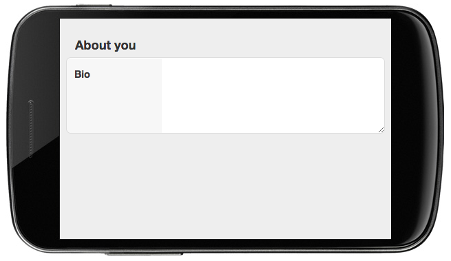
- WebMultilineEdit.ctrl
- Creates an HTML textarea on the page. This is useful whenever you need the user to enter large amounts of text.
- WebClient Control Name Properties
id: String
The unique id of this control.name: String
The field’s HTML name attribute. This property comes from the first element in the control name.controlName: String
This field contains a copy of control name property from the Plex panel.cls: String
The CSS class to add to this control element.Control Name Parameter: class
label: String
The label of this field.Control Name Parameter: label
Alternative way to set a label of the field.
For example: Plex edit field control name is set to myField.
You can set the control name of the Plex label field to myFieldLbl:myField.LabelmaxRows: Number
The maximum number of lines made visible by the input. The default value is 5.Control Name Parameter: maxRows
placeHolder: String
A string value displayed in the input when the control is empty if specified in the control name.Control Name Parameter: hint
Examples


- Javascript Config Attributes
value: String
A value to initialize this field with.disabled: Boolean
Whether or not the component is disabled.hidden: Boolean
Whether or not the component is hidden. - Events
focus (Plex event: Gained Focus)
Attempts to set the field as the active input focus.painted
Fires when the panel is first show on the device screen.blur (Plex event: Lost Focus)
Fires when the field loses input focus.keyup (Plex event: Modified)
Fires when a key is released on the input element.change (Plex event: Updated)
Fires just before the field blurs if the field value has changed.
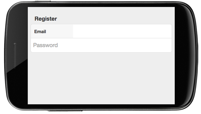
- WebPassword.ctrl
- A component to display the password field. When the user enters text, it will show up as stars.
- WebClient Control Name Properties
id: String
The unique id of this control.name: String
The field’s HTML name attribute. This property comes from the first element in the control name.controlName: String
This field contains a copy of control name property from the Plex panel.cls: String
The CSS class to add to this control element.Control Name Parameter: class
label: String
The label of this field.Control Name Parameter: label
Alternative way to set a label of the field.
For example: Plex edit field control name is set to myField.
You can set the control name of the Plex label field to myFieldLbl:myField.LabelplaceHolder: String
A string value displayed in the input when the control is empty if specified in the control name.Control Name Parameter: hint
Examples


- Javascript Config Attributes
value: String
A value to initialize this field with.disabled: Boolean
Whether or not the component is disabled.hidden: Boolean
Whether or not the component is hidden. - Events
focus (Plex event: Gained Focus)
Attempts to set the field as the active input focus.blur (Plex event: Lost Focus)
Fires when the field loses input focus.keyup (Plex event: Modified)
Fires when a key is released on the input element.change (Plex event: Updated)
Fires just before the field blurs if the field value has changed.
-
- This control is designed to call the phone number entered into the edit field.
- WebClient Control Name Properties
id: String
The unique id of this control.name: String
The field’s HTML name attribute. This property comes from the first element in the control name.controlName: String
This field contains a copy of control name property from the Plex panel.cls: String
The CSS class to add to this control element.Control Name Parameter: class
iconCls: String
Optional CSS class to add to the icon element. This is useful if you want to use a CSS background image to create your Button icon.Control Name Parameter: iconCls
The list of iconCls that can be used are below.
- star
- trash
- maps
- locate
- home
- bookmarks
- download
- favorites
- info
- more
- time
- user
- team
- action
- add
- arrow_down
- arrow_left
- arrow_right
- arrow_up
- compose
- delete
- organize
- refresh
- reply
- search
- settings
ui: String
Optional style to apply to your button.Control Name Parameter: ui
The list of ui that can be used are below:
'normal'- a basic gray button (default).'back'- a back button.'forward'- a forward button.'round'- a round button.'plain''action'- shaded using the $active-color .'decline'- shaded using the $alert-color .'confirm'- shaded using the $confirm-color .
label: String
The label of this field.Control Name Parameter: label
Alternative way to set a label of the field.
For example: Plex edit field control name is set to myField.
You can set the control name of the Plex label field to myFieldLbl:myField.LabelExamples
- Javascript Config Attributes
disabled: Boolean
Whether or not the component is disabled.hidden: Boolean
Whether or not the component is hidden.text: String
Display the text set in Plex panel properties.
- WebPhoneEdit.ctrl
- This is a normal edit field that is used for entering phone numbers. Most browsers will show a specialized virtual keyboard for phone number input.
- WebClient Control Name Properties
id: String
The unique id of this control.name: String
The field’s HTML name attribute. This property comes from the first element in the control namecontrolName: String
This field contains a copy of control name property from the Plex panel.cls: String
The CSS class to add to this control element.Control Name Parameter: cls
label: String
The label of this field.Control Name Parameter: label
Alternative way to set a label of the field.
For example: Plex edit field control name is set to myField.
You can set the control name of the Plex label field to myFieldLbl:myField.LabellabelWidth: String
The width of the field label. The value defaults to 40% unless specified in the controlName. The param name to specify the width is called width.
For example: width=50%Control Name Parameter: width
extraControl: Component
For attaching another edit field on the same row.
For example: The control name of the first edit field is myFirstField:MainArea
The control name of the second edit field is mySecondField:myFirstField.ExtraControlplaceHolder: String
A string value displayed in the input when the control is empty if specified in the control name.Control Name Parameter: hint
- Javascript Config Attributes
value: Mixed
A value to initialize this field with.maxLength: Number
The maximum number of permitted input characters.disabled: Boolean
Whether or not the component is disabled.hidden: Boolean
Whether or not the component is hidden. - Events
focus (Plex event: Gained Focus)
Attempts to set the field as the active input focus.blur (Plex event: Lost Focus)
Fires when the field loses input focus.keyup (Plex event: Modified)
Fires when a key is released on the input element.change (Plex event: Updated)
Fires just before the field blurs if the field value has changed.
-
- A component to display a button
- WebClient Control Name Properties
controlName: String
This field contains a copy of control name property from the Plex panel.cls: String
The CSS class to add to this control element.Control Name Parameter: cls
iconCls: String
Optional CSS class to add to the icon element. This is useful if you want to use a CSS background image to create your Button icon.Control Name Parameter: iconCls
The list of iconCls that can be used are below.
- star
- trash
- maps
- locate
- home
- bookmarks
- download
- favorites
- info
- more
- time
- user
- team
- action
- add
- arrow_down
- arrow_left
- arrow_right
- arrow_up
- compose
- delete
- organize
- refresh
- reply
- search
- settings
ui: String
Optional style to apply to your button.Control Name Parameter: ui
The list of ui that can be used are below:
'normal'- a basic gray button (default).'back'- a back button.'forward'- a forward button.'round'- a round button.'plain''action'- shaded using the $active-color .'decline'- shaded using the $alert-color .'confirm'- shaded using the $confirm-color .
Examples
- Javascript Config Attributes
disabled: Boolean
Whether or not the component is disabled.hidden: Boolean
Whether or not the component is hidden.text: String
Display the text set in Plex panel properties. - Events
pressed (Plex event: Pressed)
Fires when a button is pressed.
- WebSearch.ctrl
- This is a simple edit field that has a custom UI for searches.
- WebClient Control Name Properties
name: String
The field’s HTML name attribute. This property comes from the first element in the control namecontrolName: String
This field contains a copy of control name property from the Plex panel.cls: String
The CSS class to add to this control element.Control Name Parameter: class
label: String
The label of this field.Control Name Parameter: label
Examples
- Javascript Config Attributes
disabled: Boolean
Whether or not the component is disabled. - Events
focus (Plex event: Gained Focus)
Attempts to set the field as the active input focus.blur (Plex event: Lost Focus)
Fires when the field loses input focus.keyup (Plex event: Modified)
Fires when a key is released on the input element.change (Plex event: Updated)
Fires just before the field blurs if the field value has changed.
- WebShell-root.html
This is the root template for the mobile web application. The following attachpoints are defined.
HeadArea
Contains HTML elements that appear in the HTML <head> tag.JSInit
Contains Javascript statements that will be executed upon initialization before the first panel is loaded.HeaderArea
Contains WebMobile controls that appear at the top of the web panel.MainArea
Contains WebMobile controls that appear at the content pane of the web panel.HiddenArea
Contains WebMobile control that do not appear on the web panel.FullscreenArea
Contains a Web Mobile control that expands to the size of the panel. Typically used for a list.ToolbarArea
Contains Web Mobile controls that appear as elements in the toolbar.TabbarArea
Contains Web Mobile controls that appear as elements in the tabbar.FooterArea
Contains WebMobile controls that appear at the bottom of the web panel.JSOnLoad
Contains Javascript statements that will be executed after the panel is loaded.CSSArea
Contains CSS codes for the current panel.JSOnReady
Contains Javascript statemens that will be executed after the application has been loaded.LinkArea
Contains HTML link elements.
- WebSignature.ctrl
- This creates a JavaScript signature pad on the panel. The signature will be converted into a Base64 encoded image and saved to the field. Because of the Base64 encoded image's length, the field that uses this control needs to be a VaryCharacter.
- WebClient Control Name Properties
id: String
The unique id of this control.name: String
The field’s HTML name attribute. This property comes from the first element in the control namecontrolName: String
This field contains a copy of control name property from the Plex panel. - Javascript Config Attributes
value: Mixed
A value to initialize this field with.disabled: Boolean
Whether or not the component is disabled.hidden: Boolean
Whether or not the component is hidden. - Events
focus (Plex event: Gained Focus)
Attempts to set the field as the active input focus.blur (Plex event: Lost Focus)
Fires when the field loses input focus.
- WebSite.ctrl
- This control automatically handles ChildSites in the Panel. This should never have to be specifically referenced.
- WebSpinnerEdit.ctrl
- A component to display HTML5 number field.
- WebClient Control Name Properties
name: String
The field’s HTML name attribute. This property comes from the first element in the control name.controlName: String
This field contains a copy of control name property from the Plex panel.wclicls: String
A CSS class to override the base class CSS.Control Name Parameter: class
label: String
The label of this field.Control Name Parameter: label
Examples
- Javascript Config Attributes
value: String
A value to initialize this field with.disabled: Boolean
Whether or not the component is disabled. - Events
focus (Plex event: Gained Focus)
Attempts to set the field as the active input focus.blur (Plex event: Lost Focus)
Fires when the field loses input focus.keyup (Plex event: Modified)
Fires when a key is released on the input element.change (Plex event: Updated)
Fires just before the field blurs if the field value has changed.
- WebText.ctrl
- A component to display text.
- WebClient Control Name Properties
html: String
HTML content to render inside this Component or a reference to an existing element on the page.
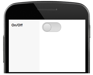
- WebToggle.ctrl
- A different presentation of the normal WebCheckbox control. It displays a slider instead of the usual checkbox. The Text value of the field in Plex will be the label for the field.
- WebClient Control Name Properties
id: String
The unique id of this control.name: String
The field’s HTML name attribute. This property comes from the first element in the control namecontrolName: String
This field contains a copy of control name property from the Plex panel.cls: String
The CSS class to add to this control element.Control Name Parameter: class
labelWidth: String
The width of the field label. The value defaults to 40% unless specified in the controlName. The param name to specify the width is called width.
For example: width=50%Control Name Parameter: width
Examples


- Javascript Config Attributes
uncheckedValue: String
The unchecked value of the field.checkedValue: String
The checked value of the field.value: String
The value to submit if the item is in a checked state.disabled: Boolean
Whether or not the component is disabled.hidden: Boolean
Whether or not the component is hidden. - Events
focus (Plex event: Gained Focus)
Attempts to set the field as the active input focus.blur (Plex event: Lost Focus)
Fires when the field loses input focus.change (Plex event: Updated)
Fires just before the field blurs if the field value has changed.
- WebURL.ctrl
- A component to display a link. When a user clicks the link, the link will be opened in a new blank page.
- WebClient Control Name Properties
controlName: String
This field contains a copy of control name property from the Plex panel.cls: String
The CSS class to add to this control element.Control Name Parameter: class
iconCls: String
Optional CSS class to add to the icon element. This is useful if you want to use a CSS background image to create your Button icon.Control Name Parameter: iconCls
The list of iconCls that can be used are below.
- star
- trash
- maps
- locate
- home
- bookmarks
- download
- favorites
- info
- more
- time
- user
- team
- action
- add
- arrow_down
- arrow_left
- arrow_right
- arrow_up
- compose
- delete
- organize
- refresh
- reply
- search
- settings
ui: String
Optional style to apply to your button.Control Name Parameter: ui
The list of ui that can be used are below:
'normal'- a basic gray button (default).'back'- a back button.'forward'- a forward button.'round'- a round button.'plain''action'- shaded using the $active-color .'decline'- shaded using the $alert-color .'confirm'- shaded using the $confirm-color .
Examples
- Javascript Config Attributes
text: String
Display the text set in Plex panel properties.disabled: Boolean
Whether or not the component is disabled.hidden: Boolean
Whether or not the component is hidden.
- WebURLPicture.ctrl
- A component to display an image. When the image is clicked, it will trigger a Plex event.
- WebClient Control Name Properties
controlName: String
This field contains a copy of control name property from the Plex panel.imageCls: String
The CSS class to use when mode is not set to ‘background.’ The default value is ‘x-image-component.’Control Name Parameter: imageCls
imageAlign: String
Set the horizontal alignment of the control. The default value is ‘left.’Control Name Parameter: imageAlign
- Javascript Config Attributes
mode: String
If set to ‘background’, uses a background-image CSS property instead of an <img> tag to display image. The default value is ‘background’.src: String
The source of the image. - Events
tap (Plex event: Pressed)
Fires when the image in tapped.
- WebVideo.ctrl
- A component to display HTML5 Video.
- WebClient Control Name Properties
id: String
The unique id of this control.name: String
The field’s HTML name attribute. This property comes from the first element in the control name.controlName: String
This field contains a copy of control name property from the Plex panel. - Javascript Config Attributes
url: String
Location of the video to play.disabled: Boolean
Whether or not the component is disabled.hidden: Boolean
Whether or not the component is hidden.


Related Articles
TrafficCam for Mobile
Watch the Walkthrough We are going to develop a mobile application with CA Plex and CM First's WebClient mobile templates. The application will allow us to access a network of real-time traffic cameras around the State of Maryland, view their live ...Web Controls
What Are the Different Types of Controls? Include files (*.inc) are evaluated within the referencing template and can be useful for repeated blocks of code. They can have parameters, such as :nc (do not evaluate comments) or :parameterName=pValue ...Incident Reporter for Mobile
Video Walkthrough Pattern Functions All functions will be under "Patterns.Mobile". CordovaPage This function inherits from ~WebShell, and has an IMPL Name of Cordova. Any function inheriting from this will use the Cordova-page.ctrl template. This ...Patch Build to CM WebClient 1.8.8
Latest Version: Date 07/16/2026 WebClient-1.8.9-pre13788 NOTE : If the hightail link doesn't open correctly the first time, please just reload the screen, we recommend using the Chrome browser to open it. IMPORTANT: The latest eclipse plugin ...How To...
1. Group Model Q: How do I change WebClient group model from licensed version to non-licensed version? A: a. Login to your group model and remove the old WebClient group model and add the new WebClient group model from your library list. b. Extract a ...